
A move, a new roommate, a name misspelled by the previous occupant: the reasons for redoing your mailbox label are common. The good news is that a home printer and a few minutes are enough to achieve a clean and readable result. You just need to know the right format, choose suitable paper, and avoid mistakes that make the label unreadable after a few weeks of exposure.
Why a readable label is essential for mail delivery
No law requires you to put your name on your mailbox. You won’t face a fine if it remains anonymous.
However, Article D90 of the Postal Code changes the game in practice: without a legible name, La Poste is relieved of its delivery obligation. Even if you do live at the address, your mail can be returned with the mention NPAI (“Does not live at the indicated address”).
In a collective building, the problem multiplies. A mail carrier serving several dozen mailboxes doesn’t have time to guess who lives where. Adding the apartment number or floor on the label reduces delivery errors and lost mail. To create a free mailbox label, you often just need an online template and a bit of method.
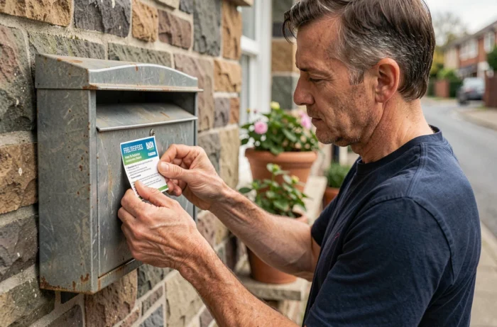
Mailbox label format and dimensions: what the standard requires
You may have noticed that all standardized mailboxes look alike? It’s not by chance. The French standard NF D 27-404 defines the dimensions of mailboxes installed in collective buildings. The integrated label holder generally measures about 10 cm wide by 2.5 cm high.
Your label must fit in this space without being folded or cropped. If you exceed the dimensions, it will curl under the transparent cover and become difficult to read.
In a single-family home, you have more freedom. Most mailboxes accept slightly larger formats. Just check the size of the label holder before printing.
Adjusting the format in a word processing software
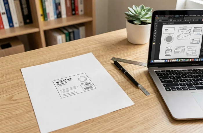
No need for design software to meet these dimensions. In a standard word processor, create a single-cell table with the correct dimensions. Set the cell’s internal margins to zero or nearly zero to increase the writing space.
Another option: online generators like Parchance offer a blank template already calibrated. You fill in your name, choose the font, and the file downloads ready to print.
Printing a durable label: paper, ink, and protection
The label you just created on screen can become unreadable in a few weeks if the printing and support are poorly chosen. Here’s what makes the difference between a label that lasts and one that fades.
- The paper weight matters more than the type of printer. Standard office paper is too thin: it curls in humidity and the ink smudges at the slightest contact with water. Prefer a paper with a sufficiently dense weight, like cardstock or matte photo paper.
- Laser ink is more water-resistant than inkjet ink. If you only have an inkjet printer, apply a layer of clear spray varnish or slip the label under a self-adhesive plastic film before cutting it out.
- The transparent label holder of the mailbox offers initial protection, but it is not waterproof. A thin lamination remains the best guarantee of longevity. A simple cold lamination pouch, without a machine, is sufficient.
Black text on a white background or colored background
The maximum contrast for readability remains black text on a white background. Nothing prevents you from adding a colored background or a subtle pattern, but the last name must remain perfectly legible from one meter away.
Choose a sans-serif font (like Arial or Helvetica) in a sufficient size. On a label that is 2.5 cm high, a font that is too small or too stylized makes the name indecipherable for the hurried mail carrier.
Personalizing your label without compromising readability
Free tools like Canva or Parchance offer templates with decorative images, bright colors, and fancy fonts. The temptation to over-personalize is strong.
Keep one principle in mind: the mail carrier looks at your label for only a fraction of a second. Anything that distracts from the name and apartment number hinders delivery.
What works well in personalization
- A colored border around the edges to easily spot your mailbox in a row.
- A “No advertising” mention on the second line, in a smaller font than the name.
- A discreet pictogram (house, flower, animal) placed to the left of the text, which does not encroach on the reading area.
What works poorly: busy photographic backgrounds, thin cursive fonts, and light-colored text on pastel backgrounds. Always prioritize contrast and simplicity.
Two lines are sufficient in most cases
First line: last name, possibly preceded by the initial of the first name. Second line: apartment number, floor, or mention “No advertising.” Beyond that, the text becomes too small to be easily read through the label holder.
A well-thought-out label fits on two lines, prints in five minutes, and protects your mail for months. The only real investment is the choice of paper and a basic lamination. The rest can be handled easily by any computer and any home printer.